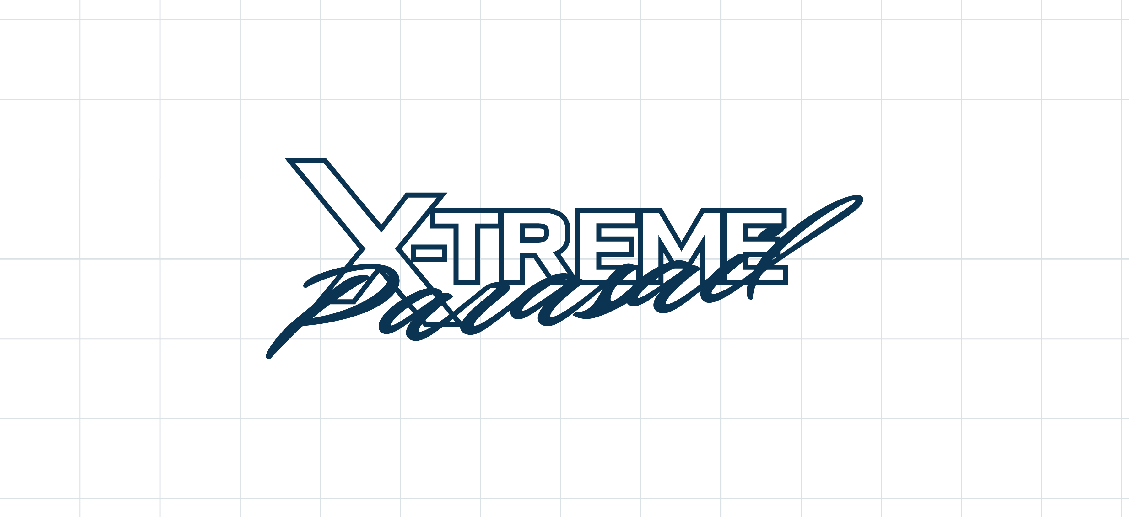
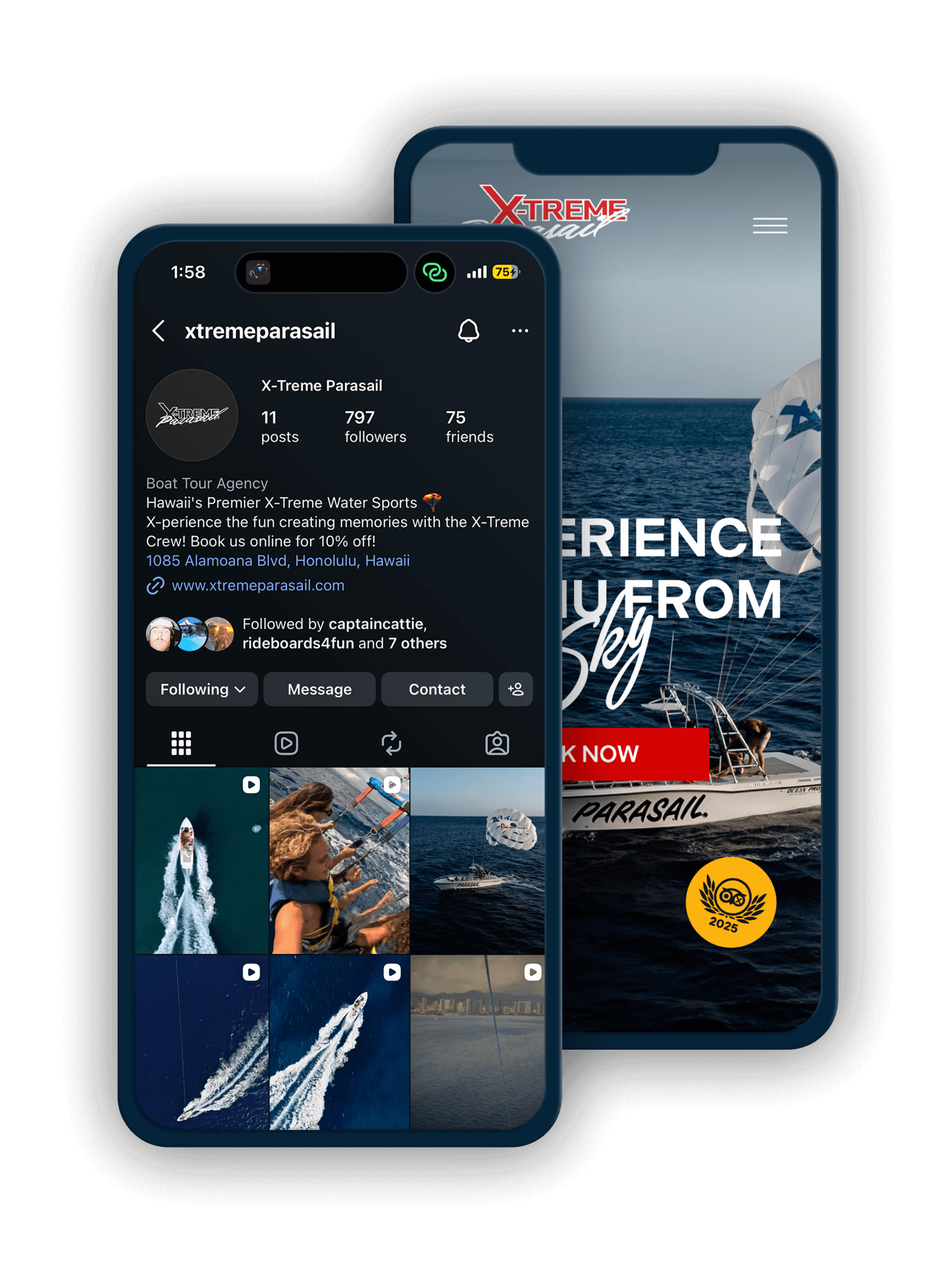
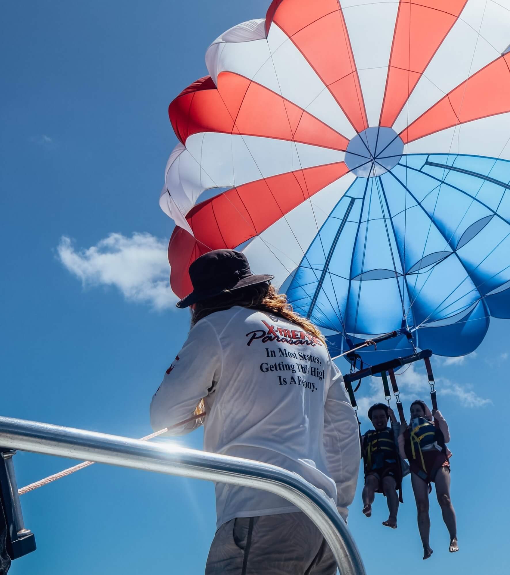

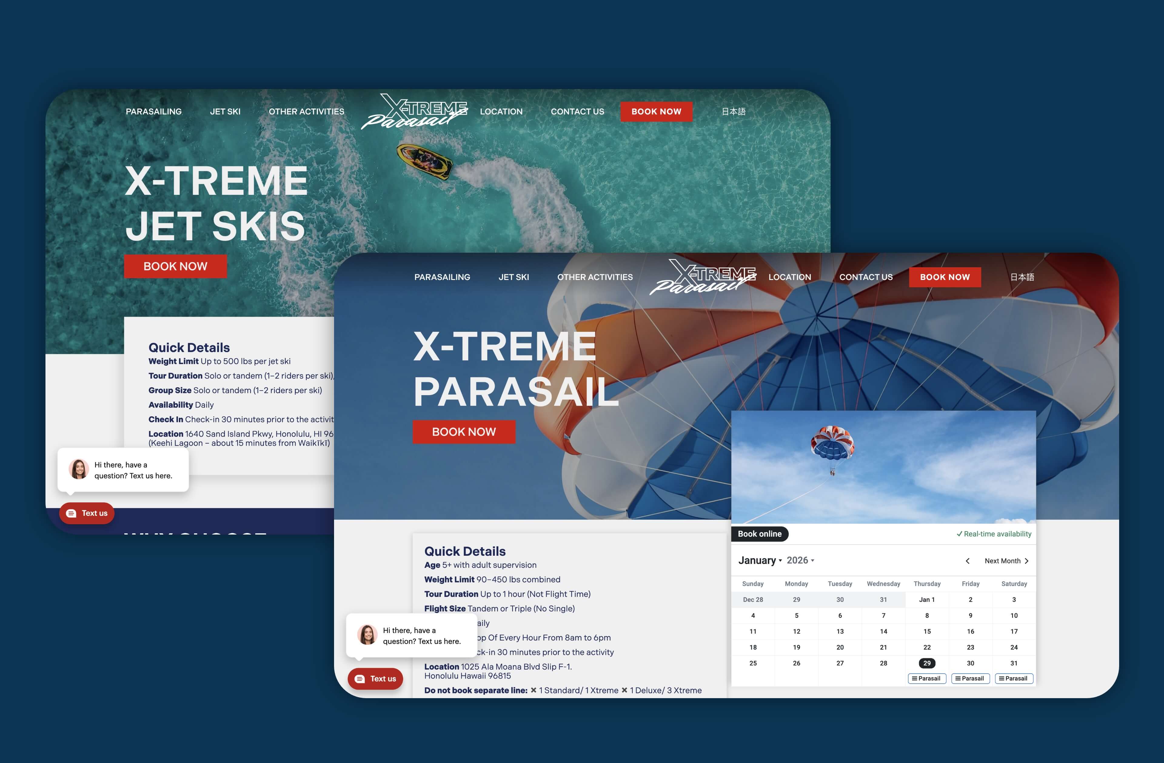
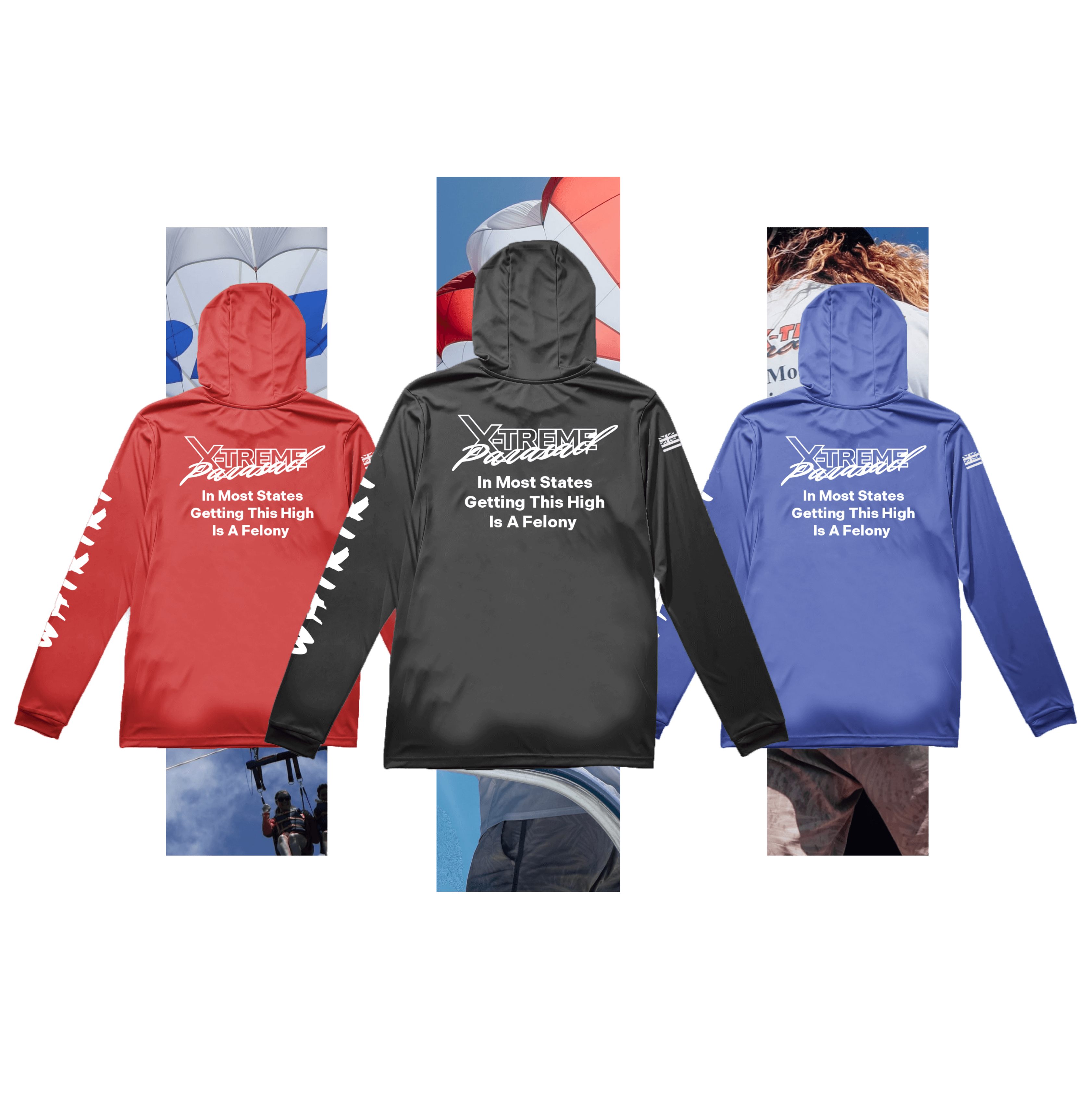
Parasailing is already visually powerful — the brand didn’t need to over-explain itself. Instead, the challenge was restraint and focus: letting the experience lead while building a system that felt strong, modern, and confident.
We leaned into:
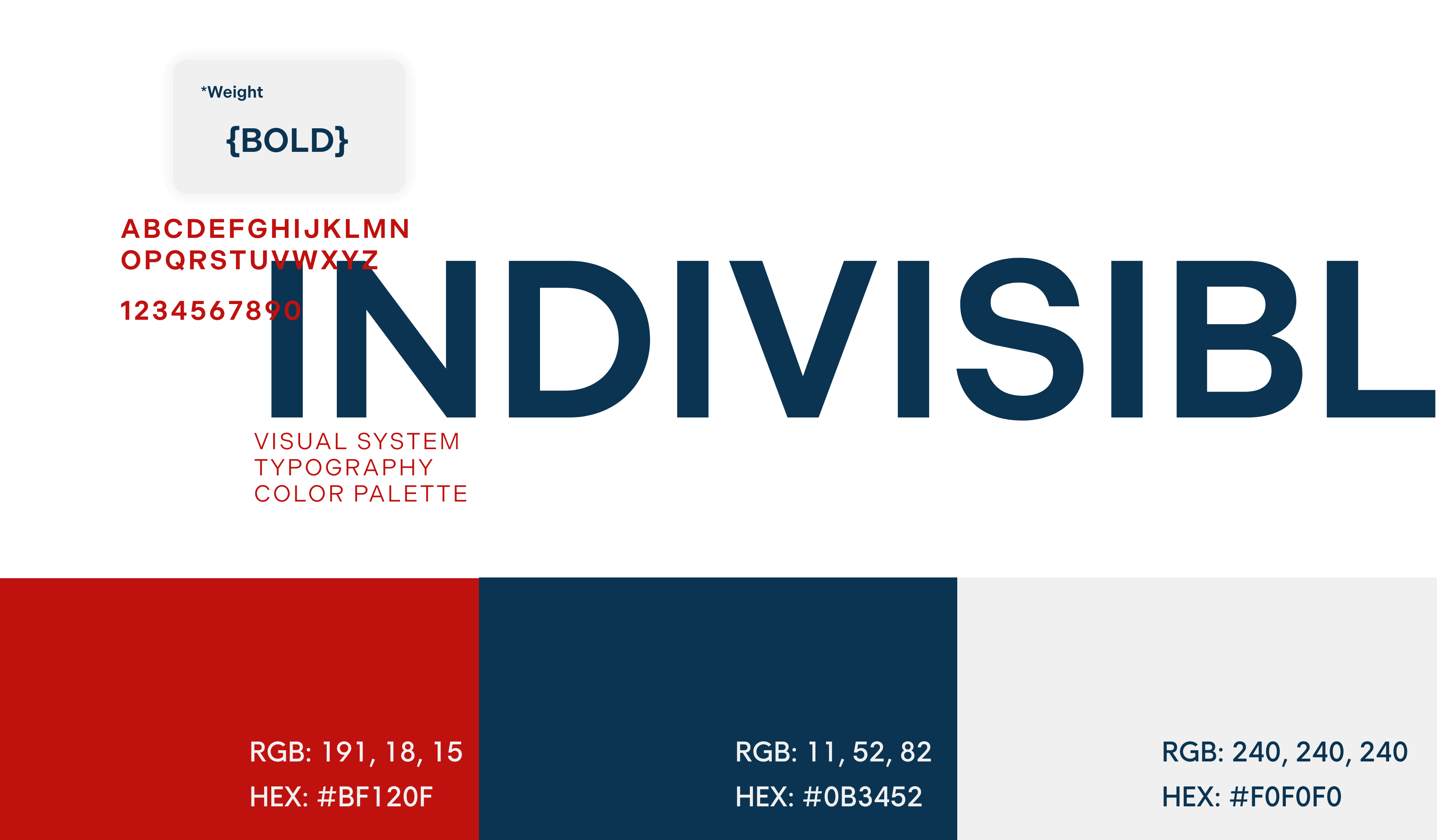
High contrast color usage for maximum visibility on water and at distance
Strong typographic hierarchy for instant recognition
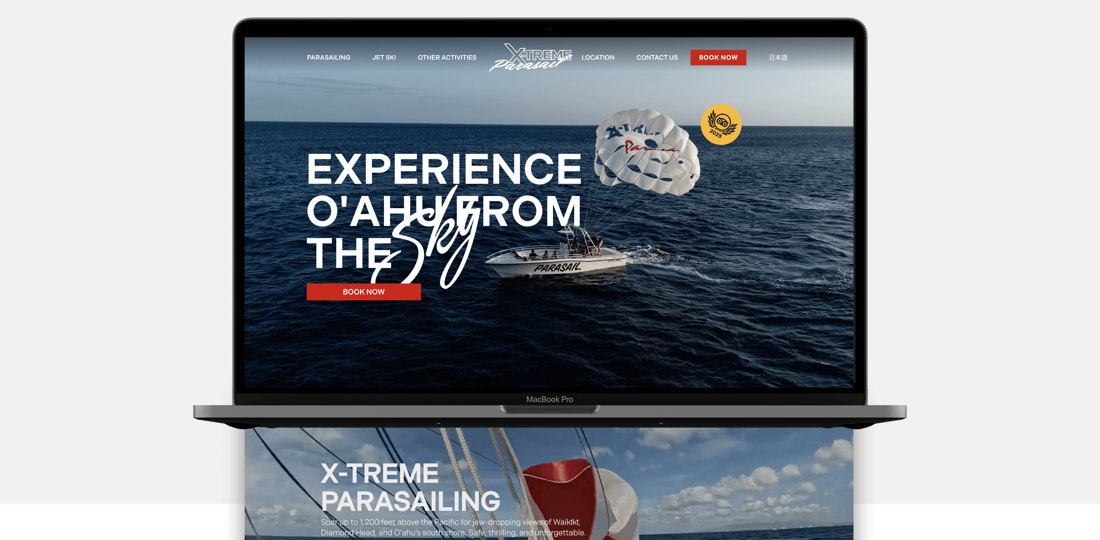
Clean layouts that let photography do the heavy lifting
Messaging that feels bold without being gimmicky
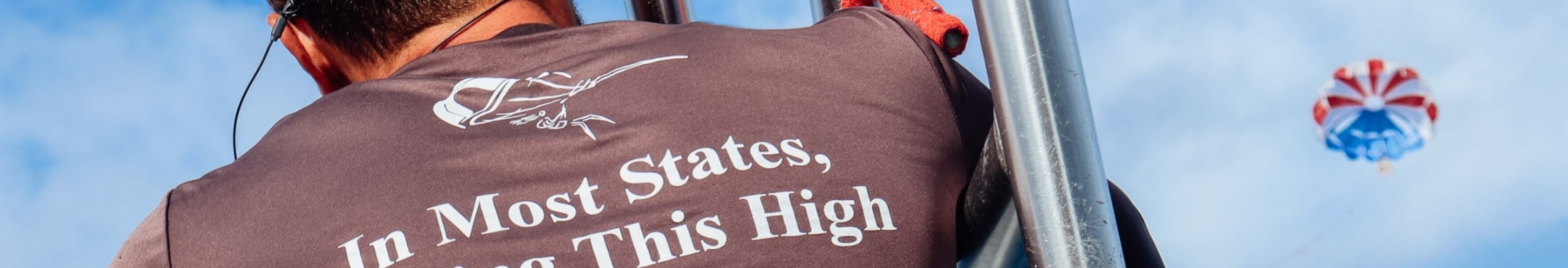
The result is a brand that feels just as strong on a phone screen as it does on the back of a hoodie or the side of a boat.

